Introduction
Some data sets that have a datetime facet lend themselves nicely to data play back using time lapse. Sometimes playing back data like this can lead to insights that may have been missed through other visualization representations. Finding good examples is hard especially when you can argue that various trends or anomolies would also show up just as easily in more basic graph plots.
It would be nice if the PivotViewer filter panel was bound to data so that a timer could fire and animate the selected datetime range so automatically animating the selected PivotViewer items view in a time lapse. For now we can simulate this by manipulating the control’s ViewState and progressing the range for a target datetime facet.
Sample Collection Data

NTSB 2008 - 2009 Aviation Incidents by Severity
FAA data for aviation incidents by severity for 2008 and 2009 to give you an overview. Incidents resulting in one or more fatalities are colored red.

NTSB 2008 - 2009 Aviation Incidents by Month
FAA data for aviation incidents by month for 2008 and 2009 which shows the seasonal variation that peaks in August. Be careful not to misinterpret this as the overall volume of flights is not represented.

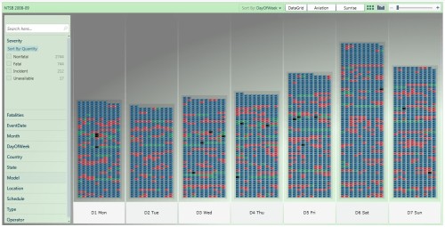
NTSB 2008 - 2009 Aviation Incidents by Day-of-Week
FAA data for aviation incidents by day-of-week for 2008 and 2009 which shows a modest peak on saturdays.

NTSB 2008 - 2009 Aviation Incidents for top States
FAA data for aviation incidents by state for 2008 and 2009 which shows the states with most incidents: California, Texas, Florida, Arkansas, …
Timelapse of Incidents by State
I don’t know the real reasons for the observed trends though some are likely to be seasonal and others definitely related to holiday periods and holiday destinations resulting in increased traffic.

NTSB Aviation Incidents by State - Jan 1, 2008
Starting in January 2008 the incidents are relatively light with the most in California and Florida.

NTSB Aviation Incidents by State - Jan 15, 2008
For whatever reason the number of incidents pick up sharply for Texas as we move into early February 2008.

NTSB Aviation Incidents by State - Feb 5, 2008
Throughout February 2008, the number of incidents increases overall but most markedly in Florida. Meanwhile the incident rate reduced in California.

- NTSB Aviation Incidents by State – April 1, 2008
Moving forward to April 2008 the distribution of incidents changes again with Texas ahead and Arkansas suffering more.

- NTSB Aviation Incidents by State – Jun 24, 2008
Moving forward to June 2008 the number of incidents across the states builds up and California is tops again but now followed by a peak in Illinois for what reason I do not know.
Here is a short video screen capture of a segment of the timelapsed playback.

Click to play clip of PivotViewer Timelapse
There are a lot of additional facets to the full collections of FAA / NTSB data and many more trends and interesting visualization opportunities. Stay tuned to our blog…
Links
Conclusion
This article is just a brief introduction to the possibility of playing PivotViewer collection data back as a timelapsed visualization opportunity. It is arguable whether or not this somewhat fashionable approach to visualization really gives a better insight than more traditional visualization paradigms. It all depends on whether there is really any trends in your data sets that are obscured when viewed as simple charts and graphs. Any comments or request for future topics are welcome.


Pingback: Xpert360 PivotViewer Blog Article Index | Xpert360 Ltd Development Blog